Preview: The Assassination of Margaret Thatcher — Liverpool Everyman (2–23 May 2026)
History doesn’t always arrive with fanfare. Sometimes it slips in quietly, through a half-open window, carrying something far more dangerous. This May,
A well-designed book cover can increase sales by up to 50%. This staggering statistic underscores the transformative power that a single visual element can have on a literary work. At The Broken Spine, we believe that a book cover isn’t just a marketing gimmick—it’s an art form in itself and a crucial aspect of the reader’s experience.
Modern book cover design has come a long way from its utilitarian origins. Pioneering designers of the mid-20th century, like Paul Rand and Alvin Lustig, elevated it to an art form. Today, the book cover serves not just as a protective casing but as a narrative element that augments the text within.
Colour, typography, and imagery are more than aesthetic choices; they shape the reader’s emotional engagement. Take, for instance my debut, Neon Ghosts, where cover artist Stuart M Buck crafts a hauntingly beautiful landscape that encapsulates themes of jazz, Americana, and nostalgia. It’s a visual symphony that harmonizes with Parry’s literary composition, inviting readers into a multi-sensory experience.

Especially in the worlds of poetry and flash fiction, where brevity reigns, a cover can say a thousand words. The Mask by Eli Horan uses hot tiles to evoke a rich cultural tapestry, offering an intriguing backdrop for the world within the pages. Designed by me, it’s a cover that both masks and unveils, daring readers to delve deeper into Horan’s, and by extension Frida Kahlo’s, world.

In a digital landscape where a book competes for attention amid countless others, an eye-catching cover can make all the difference. Matthew M. C. Smith’s The Keeper of Aeons with its cosmic artwork, immediately grabs attention and promises an exploration of existential themes, enhancing its marketability. Its cover features artwork from Aldiaz Nasher Arighi. The cover art captures a space scene, creating an aura of cosmic mystery that aligns well with the themes within the chapbook. It’s an illustrative example of how cover art can evoke curiosity while also reflecting the depth and complexity of the work it envelopes.

A book cover has the power to represent or misrepresent the diversity within its pages. The Broken Spine takes this responsibility seriously, serving as an ally for LGBTQIA+ rights and championing a diverse spectrum of voices. Elizabeth Kemball’s cover for Four Forked Tongues, which she also contributed to, symbolizes a true collective spirit, resonating with our ethos of inclusivity. Four Forked Tongues is a collection of four short stories with unreliable narrators written by four emerging female voices.

Elizabeth Kemball once again makes her artistic mark with the cover for Ellie Rees’s Modest Raptures. Inspired by Rees’s poem about art, the cover becomes an artifact within an artifact—a meta-commentary on the act of artistic creation. It goes beyond mere representation, adding an extra layer of meaning and interpretation. The subtlety and complexity mirror our own commitment to deep, layered storytelling, both visual and written.

Creating the perfect book cover is not without its challenges. For example, while designing the cover for Surviving Death, the straightforward yet haunting image of tree rings was debated extensively before it was finalized. This level of engagement and transparency is what sets The Broken Spine apart. We invite our readers to join us in our artistic journey, celebrating both our achievements and our challenges.

Blending Americana and Mythology in Twenty Seven
When an author takes on the role of cover designer, as in the case of Twenty Seven by myself, the results can be doubly insightful. Here, I blend Americana with classical mythology, all depicted in an old-school traditional American tattoo style. It’s a heady mix that is reflective not just of the book’s thematic richness but also of the multifaceted expertise I try to bring to The Broken Spine. Such covers serve as exemplars of our dedication to quality, blending multiple influences to create a harmonious whole. Adding to the complexity of the Twenty Seven is the Art Deco typography, a stylistic choice that cleverly reinforces the book’s themes of excess and Americana. The Art Deco movement, known for its opulence and ornamentation, dovetails beautifully with the book’s thematic interplay between classical antiquity and American pop culture. It serves as a nod to the grandeur of the 1920s—a period of great cultural and artistic expansion in America—and lends an additional layer of sophistication to the cover.

In sum, a book cover is much more than just an attractive facade. It’s a vital component of the book’s overall impact, reflecting the quality and depth that The Broken Spine is committed to delivering. We invite you to engage with us further on this fascinating subject, perhaps in one of our upcoming events centered on the art of book cover design.

History doesn’t always arrive with fanfare. Sometimes it slips in quietly, through a half-open window, carrying something far more dangerous. This May,

There’s a particular kind of alchemy required to approach the catalogue of Bob Dylan without either genuflecting into museum-piece reverence or collapsing

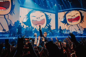
As someone who grew up seeing Damon Albarn bossing Britpop with the Fred Perry-clad, ever-pogoing Blur, it’s strange to think that he’s
The Broken Spine is a poetry and arts collective proudly published on the coastal edge of North-West England. Founded in 2019 by Alan Parry and Paul Robert Mullen – two school friends reunited after twenty years through a mutual love of poetry.